

Showing posts with label branding. Show all posts
Showing posts with label branding. Show all posts
Wednesday, October 9, 2019
Tuesday, July 9, 2019

Tuesday, September 1, 2015
New Logo for Google
If you haven't seen Google's new logo yet you can see it here and will soon see it on all of their products.

See how it has evolved.
According to Google, these are the reasons why they updated their logo:
"These days, people interact with Google products across many different platforms, apps and devices—sometimes all in a single day. You expect Google to help you whenever and wherever you need it, whether it’s on your mobile phone, TV, watch, the dashboard in your car, and yes, even a desktop!
Today we’re introducing a new logo and identity family that reflects this reality and shows you when the Google magic is working for you, even on the tiniest screens. As you’ll see, we’ve taken the Google logo and branding, which were originally built for a single desktop browser page, and updated them for a world of seamless computing across an endless number of devices and different kinds of inputs (such as tap, type and talk).
It doesn’t simply tell you that you’re using Google, but also shows you how Google is working for you. For example, new elements like a colorful Google mic help you identify and interact with Google whether you’re talking, tapping or typing. Meanwhile, we’re bidding adieu to the little blue “g” icon and replacing it with a four-color “G” that matches the logo.
Tuesday, July 28, 2015
go local Relocation Services
Project
Logo design
Webpage design and development
Business Presentation template
Client
go local

Logo Design
The client had a very specific image in mind which was translated into the icon of the logo. The identity had to be fresh, modern and not too corporate. Bright, non traditional colors were chosen to transmit the energy and friendliness of the company.
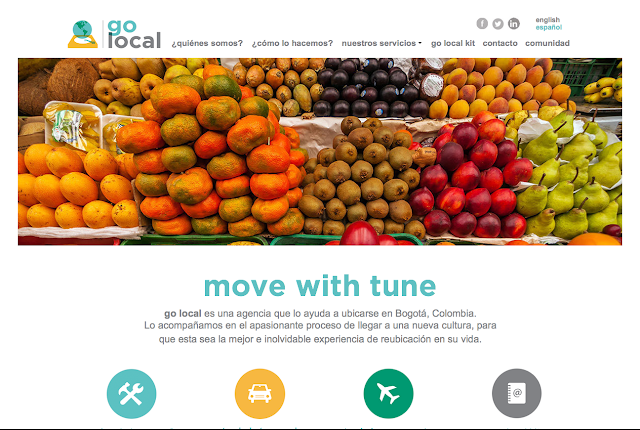
Webpage
A clean and bright webpage was created in both English and Spanish to cater to international and local clients in need of relocation services. Colorful icons were created for easy navigation. Non traditional imagery and photographs were used to differentiate the company from other relocation services, to avoid some of the cliche images commonly used such as globes and to show another side of Bogotá that showcases the city's colors and vibrancy.


Business Presentation Template
A presentation template was designed using the same look & feel of the website. Guides and guidelines were developed to maintain brand consistency throughout. Color palettes, fonts and icons were incorporated in order to make the template easy to use and ensure that all of the elements properly represent the brand.

Thursday, March 5, 2015
Corporate Identities and Logo Design
Sagal


The icon for this logo is a bird called "Caica". These birds are frequently found walking around the farm where the the roses for Caicas Flowers are grown.

Both vertical and horizontal versions of the logo were created.


Structure and meaning behind their logo.


Aquadek

Concepts developed for a Aquadek, a system made out of PVC tubes that purifies water.


Logo created for a restaurant that specializes in meat and sells a variety of cuts for customers to take home.
Caicas Flowers
The icon for this logo is a bird called "Caica". These birds are frequently found walking around the farm where the the roses for Caicas Flowers are grown.
Both vertical and horizontal versions of the logo were created.
Go Local
This logo was designed for a relocation agency that wanted something modern, fresh, casual and not very corporate.
Latin Financial Strategies

Brand architecture for Latin Financial Strategies, LFS Auto Leasing and LFS Business Capital.
Estrategias en Liquidez

Branding development for Estrategias en Liquidez.

Structure and meaning behind their logo.
Happy Bees Kindergarten
Happy Bees Kindergarten came to us in need of a playful and cheerful logo for their kindergarten located in La Calera, Colombia.
Common Purpose Clothing

Logo
for common purpose clothing, a clothing company whose essence is
represented by a flock of flying birds that have a desire to fly higher
and further while maintaining a common purpose of staying together,
protect and envelop each other and make themselves known as a species.

Page from the Corporate Identity Manual showing the color palette in Pantone values, CMYK and RGB.
Pablo Salgado Photography


Logos for Pablo Salgado Photography who photographs wedding, portraits and more.
Aquadek
Thursday, February 12, 2015
A Look Back at Radio Shack
Now that Radio Shack may be no more after having filed for bankruptcy, we decided to take a look back at the the once very popular brand and it's evolving logo.


Original logo (1920s)
Updated logo (1940s)
The word the is removed from the logo (1950s)
Corporation is eliminated from the logo (1960s)
Big re design (1980s)
R icon is created (1995)
A lot of extra detail and effects added (2001)
...and it is simplified and flattened again (2011)
Tuesday, April 1, 2014
Recent Work: Scientifica

Project: Business Cards and Corporate Presentation Templates
Client: Scientífica
Corporate Presentation Template Cover

Content Divider with same look & feel as the business cards


Presentation slides including guidelines for fonts, sizes and tables

Slide with samples of design elements to be used throughout the presentation to highlight important information
Tuesday, July 9, 2013
Corporate Identities and Logos
Logo created for a restaurant that specializes in meat and sells a variety of cuts for customers to take home.
Caicas Flowers
The icon for this logo is a bird called "Caica". These birds are frequently found walking around the farm where the the roses for Caicas Flowers are grown.
Both vertical and horizontal versions of the logo were created.
Go Local
This logo was designed for a relocation agency that wanted something modern, fresh, casual and not very corporate.
Latin Financial Strategies
Brand architecture for Latin Financial Strategies, LFS Auto Leasing and LFS Business Capital.
Estrategias en Liquidez
Branding development for Estrategias en Liquidez.
Structure and meaning behind their logo.
Happy Bees Kindergarten
Happy Bees Kindergarten came to us in need of a playful and cheerful logo for their kindergarten located in La Calera, Colombia.
Common Purpose Clothing
Logo for common purpose clothing, a clothing company whose essence is represented by a flock of flying birds that have a desire to fly higher and further while maintaining a common purpose of staying together, protect and envelop each other and make themselves known as a species.
Page from the Corporate Identity Manual showing the color palette in Pantone values, CMYK and RGB.
Pablo Salgado Photography
Logos for Pablo Salgado Photography who photographs wedding, portraits and more.
Aquadek
Subscribe to:
Posts (Atom)