

Showing posts with label arangostudio. Show all posts
Showing posts with label arangostudio. Show all posts
Tuesday, March 24, 2020
Thursday, January 2, 2020

Monday, December 9, 2019
Wednesday, October 9, 2019

Tuesday, July 9, 2019

Friday, March 8, 2019

Wednesday, November 21, 2018
American Express Food & Wine Connoisseur Club


The Food & Wine Connoisseur Club is an epicurean club offering culinary travel packages, discounts and savings on gourmet food, wine and kitchen supplies.
The Appetizer (above) is a small booklet that was sent as a preview to all the benefits, destinations and great products that clients would receive once they joined the club. Membership greatly increased with the introduction of the Appetizer.


Clients received the Main Dish Membership Kit once they became members of the Connoisseur Club. The kit contains a welcome letter, membership card, newsletter with travel packages information and special culinary products from various partners.
Travel + Leisure Elite Traveler

Travel + Leisure Elite Traveler offers great deals on travel destinations targeted to Travel + Leisure magazine readers. Members receive recommendations on "World's Best" locations, hotels, cruises and more.

Elite Traveler Destinations is a newsletter that was sent to members showcasing a different destination and discounted cruise and hotel packages.
Wednesday, September 12, 2018
Good Design Can Make You Happy!
Some days we need a little bit of inspiration, especially on dark and dreary afternoon. We thought you might too. So we decided we would share this talk by graphic designer Stefan Sagmeister who shows us moments in his life where design made him happy.
Please enjoy and share!
Please enjoy and share!
Tuesday, January 23, 2018
Landing Page for Toshiro Robatayaki
Project
Landing Page for Toshiro Robatayaki
Client Toshiro Robatayaki
Landing Page design

According to Unbounce, "a landing page is any web page that a visitor can arrive at or “land” on. However, when discussing landing pages within the realm of marketing and advertising, it’s more common to refer to a landing page as being a standalone web page distinct from your main website that has been designed for a single focused objective.
This means that your landing page should have no global navigation to tie it to your primary website. The main reason for this is to limit the options available to your visitors, helping to guide them toward your intended conversion goal."


We created a responsive landing page for Toshiro Robatayaki, a Japanese restaurant located in Bogotá, Colombia. The focus of the landing page is to introduce people to their Nikkei (Japanese Peruvian cuisine) festival and get visitors to enter their email address to receive information on upcoming festivals and events.

The landing page has had a successful response rate and the restaurant has been able to capture valuable leads in a short period of time.
Landing pages are a great tool for promoting a new product, event, webinar, creating specific inbound advertising campaigns and capturing leads. If you are interested in finding out how your business could benefit from a landing page, let us know and we will be happy to help. Email us at hello@arangostudio.com, call us at 57 314.394.6302 or skype me at laura.arango.m.
Landing Page for Toshiro Robatayaki
Client Toshiro Robatayaki
Landing Page design
According to Unbounce, "a landing page is any web page that a visitor can arrive at or “land” on. However, when discussing landing pages within the realm of marketing and advertising, it’s more common to refer to a landing page as being a standalone web page distinct from your main website that has been designed for a single focused objective.
This means that your landing page should have no global navigation to tie it to your primary website. The main reason for this is to limit the options available to your visitors, helping to guide them toward your intended conversion goal."


We created a responsive landing page for Toshiro Robatayaki, a Japanese restaurant located in Bogotá, Colombia. The focus of the landing page is to introduce people to their Nikkei (Japanese Peruvian cuisine) festival and get visitors to enter their email address to receive information on upcoming festivals and events.

The landing page has had a successful response rate and the restaurant has been able to capture valuable leads in a short period of time.
Landing pages are a great tool for promoting a new product, event, webinar, creating specific inbound advertising campaigns and capturing leads. If you are interested in finding out how your business could benefit from a landing page, let us know and we will be happy to help. Email us at hello@arangostudio.com, call us at 57 314.394.6302 or skype me at laura.arango.m.
Thursday, June 1, 2017
What emotion do you want your logo to transmit?
Not
sure what color to use for your logo? Here are some examples of very
well known logos and how these businesses use color to create an emotion
associated with their brand.

Infographic by: Ruby Media Corporation
Still not sure? We will happy to help. Just send us an e-mail at hello@arangostudio or reach out via skype at laura.arango.m and we will get back to you. If you are in Colombia, give us a call at 57.314.394.6302.
Infographic by: Ruby Media Corporation
Still not sure? We will happy to help. Just send us an e-mail at hello@arangostudio or reach out via skype at laura.arango.m and we will get back to you. If you are in Colombia, give us a call at 57.314.394.6302.
Monday, December 26, 2016

Tuesday, May 17, 2016
Landing Page for Toshiro Robatayaki
Project
Landing Page for Toshiro Robatayaki
Client Toshiro Robatayaki
Landing Page design
According to Unbounce, "a landing page is any web page that a visitor can arrive at or “land” on. However, when discussing landing pages within the realm of marketing and advertising, it’s more common to refer to a landing page as being a standalone web page distinct from your main website that has been designed for a single focused objective.
This means that your landing page should have no global navigation to tie it to your primary website. The main reason for this is to limit the options available to your visitors, helping to guide them toward your intended conversion goal."
We created a responsive landing page for Toshiro Robatayaki, a Japanese restaurant located in Bogotá, Colombia. The focus of the landing page is to introduce people to their Nikkei (Japanese Peruvian cuisine) festival and get visitors to enter their email address to receive information on upcoming festivals and events.
The landing page has had a successful response rate and the restaurant has been able to capture valuable leads in a short period of time.
Landing pages are a great tool for promoting a new product, event, webinar, creating specific inbound advertising campaigns and capturing leads. If you are interested in finding out how your business could benefit from a landing page, let us know and we will be happy to help. Email us at hello@arangostudio.com, call us at 57 314.394.6302 or skype me at laura.arango.m.
Tuesday, February 16, 2016
Best Logo Redesigns of 2015
Last year was a big year for logos that were redesigned. We saw many large brands refresh and update their logos. Some successfully and others not so much.
These are some of the best redesigned logos of 2015:
 IHOP's original logo was more detailed and the word "restaurant" was contained in a curve that faced down.
 The new logo is cleaner and simpler. Instead of a frown, it now has a smile.
 Sbarro updated their flag shaped logo when sales began to slump.

The logo now has a crisp new shape in the form in a pizza slice.


 The original logo for Google Ventures maintained many of Google's old branding elements and had a lot going on.
 The new logo used the new Google "G" which cuts into a sharp angled V creating a stronger image.
These are some of the best redesigned logos of 2015:


Facebook's original logo had some character when it came to the typeface.

Their new logo has very subtle changes that many people didn't even notice. The "a" and the "b" are the most noticeable changes while the "f" remains the same. Had you noticed the change?


Thursday, December 10, 2015
What is wrong with Crowdsourcing a Logo Design?

Many of you are probably familiar with crowdsourcing which is defined by Merriam-Webster as the process of obtaining needed services, ideas, or content by soliciting contributions from a large group of people, and especially from an online community, rather than from traditional employees or suppliers; a portmanteau of "crowd" and "outsourcing,". In some circumstances, it is actually a very useful approach to solving certain problems, however that is certainly not the case in design (especially logo design).
This letter written by AIGA (American Institute of Graphic Arts) to the Tokyo Olympic Committee explains what is wrong with crowdsourcing logo design:
"Competitions that ask designers to contribute their creativity and hours of work without remuneration in the hopes of their work being selected are against the global standards of professional practice for communication designers. In essence, a compromise of the ethics of the profession that protect the interests of designers, clients, and the potential for extraordinary outcomes. The reason for this is that any remarkable design is the result of a designer working with the client to create an outcome that captures all of the interests and needs of the client and the messages to be illuminated. This cannot be done without a collaborative engagement with the client in advance of designing the results.
Secondly, if the competition is open to the broader public rather than trained and experienced professionals, it demonstrates both disrespect for a universally respected Japanese profession and also suggests that the interests of the committee are served as easily by those with little experience as those with judgment and skill."
Click here to read the complete letter.
Thursday, November 26, 2015
Thankful!

What are you thankful for? Let us know.
In the meantime, here is a great Ted talk on gratitude and happiness that is worth watching.
Wednesday, November 18, 2015
Wedding Invitation is in the Bag
Project
Wedding Branding
Wedding Invitations
Save the Date and Wedding E-vite
Client
María Alejandra y Jairo Andrés


Wedding Branding
Wedding Invitations
Save the Date and Wedding E-vite
Client
María Alejandra y Jairo Andrés

Wedding Invitation
The bride and groom wanted to send a non-traditional invitation to friends and family inviting them to a beach side wedding on the island of San Andres in Colombia. We created a casual and fun invitation printed on a tote made from recyclable material that guests could use during the weekend of the destination wedding.
Wedding Branding
Branding was created for the wedding to be used on the invitations and as part of the decoration. This logo was used as a sticker to be placed on water bottles handed to guests at the party.
E-vite
Not all guests live in the same city or country as the bride and groom, therefore they requested a digital version of the invitation (e-vite) that could be easily emailed.
If
you have a wedding, family or corporate event coming up and need a
customized invitation, let us know. Call us at (57) 314.394.6302 or email us
at hello@arangostudio.com. We also design save the date invites, rsvp cards and customized decorative items to add to personalize your event.
Friday, October 9, 2015
October is Breast Cancer Awareness Month


Tuesday, September 1, 2015
New Logo for Google
If you haven't seen Google's new logo yet you can see it here and will soon see it on all of their products.

See how it has evolved.
According to Google, these are the reasons why they updated their logo:
"These days, people interact with Google products across many different platforms, apps and devices—sometimes all in a single day. You expect Google to help you whenever and wherever you need it, whether it’s on your mobile phone, TV, watch, the dashboard in your car, and yes, even a desktop!
Today we’re introducing a new logo and identity family that reflects this reality and shows you when the Google magic is working for you, even on the tiniest screens. As you’ll see, we’ve taken the Google logo and branding, which were originally built for a single desktop browser page, and updated them for a world of seamless computing across an endless number of devices and different kinds of inputs (such as tap, type and talk).
It doesn’t simply tell you that you’re using Google, but also shows you how Google is working for you. For example, new elements like a colorful Google mic help you identify and interact with Google whether you’re talking, tapping or typing. Meanwhile, we’re bidding adieu to the little blue “g” icon and replacing it with a four-color “G” that matches the logo.
Tuesday, July 28, 2015
go local Relocation Services
Project
Logo design
Webpage design and development
Business Presentation template
Client
go local

Logo Design
The client had a very specific image in mind which was translated into the icon of the logo. The identity had to be fresh, modern and not too corporate. Bright, non traditional colors were chosen to transmit the energy and friendliness of the company.
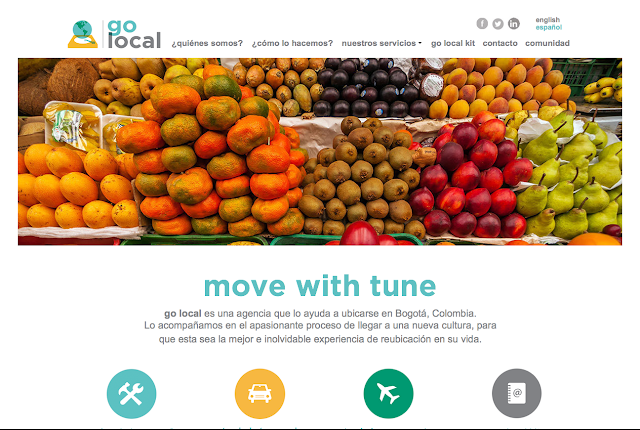
Webpage
A clean and bright webpage was created in both English and Spanish to cater to international and local clients in need of relocation services. Colorful icons were created for easy navigation. Non traditional imagery and photographs were used to differentiate the company from other relocation services, to avoid some of the cliche images commonly used such as globes and to show another side of Bogotá that showcases the city's colors and vibrancy.


Business Presentation Template
A presentation template was designed using the same look & feel of the website. Guides and guidelines were developed to maintain brand consistency throughout. Color palettes, fonts and icons were incorporated in order to make the template easy to use and ensure that all of the elements properly represent the brand.

Tuesday, July 7, 2015
MTV Popland Event

MTV Popland! Event
Client
MTV Invitation Design
In collaboration with Mirona/Nube Dreams Come True
arangostudio is known to collaborate on many projects with different partners and allies. We believe in coming together to provide solutions for our clients or those of other small businesses that can benefit from our joint effort.
One of our most recent collaborations was for MTV Networks and the
launch party for a new soap opera style show called Popland that was
taking place in Bogotá. Mirona,
the company in charge of organizing the event, contacted us so that we
could develop a concept for two sets of invitations. One set that was
to be sent to the general public and the other to VIP guests.
The show tells the story of a girl who becomes a paparazzi and how her
life evolves around celebrities and gossip. We decided to focus on the
paparazzi aspect, creating two invitations that played on the concept of
making the guest either a paparazzi taking the picture or a celebrity
having his/her photo taken.


One of the original concepts was to create a pop-up card that would resemble the flash of a camera when opened.

For VIP guests, we used point and shoot disposable cameras with the logo and look & feel from the show.
Subscribe to:
Posts (Atom)